
Programed is a healthcare scheduling system used in pediatric wards to coordinate appointments and support doctors in patient follow-ups.
Users experienced delays and frustration due to inefficient workflows and lack of error recovery.
I redesigned key flows, introduced recovery paths, and improved visual hierarchy to support real-world usage.
This resulted in a 25% reduction in patient waiting times and more efficient task completion for medical staff.
Critical tasks required too many steps, screens lacked clear hierarchy, and users had no way to recover from common mistakes, leading to delays in patient care.
Simplified key workflows by reducing steps and consolidating screens to improve task efficiency
Introduced recovery paths (e.g. cancellation and error handling) to support real-world usage
Redesigned visual hierarchy using readable typography and low-saturation colors to reduce eye strain
Improved navigation clarity to minimize cognitive load during repetitive tasks
Created a scalable design system and UI kit to ensure consistency and support future product growth
Before
Incomplete user-flows, messy navigation, outdated UI
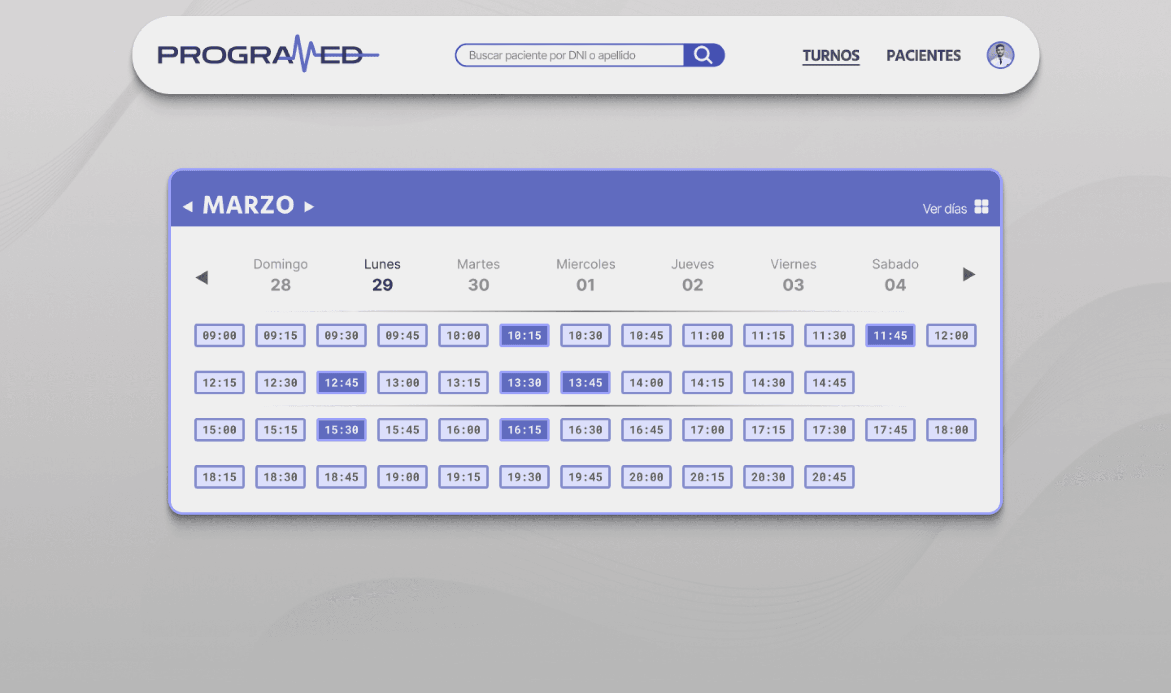
Users could not delete or edit an appointment
Users had poor control over shows and no-shows
The system had many unnecesary pages
Poor visual hierarchy leading to accesibility
& usability issues
No feedback from the system at all
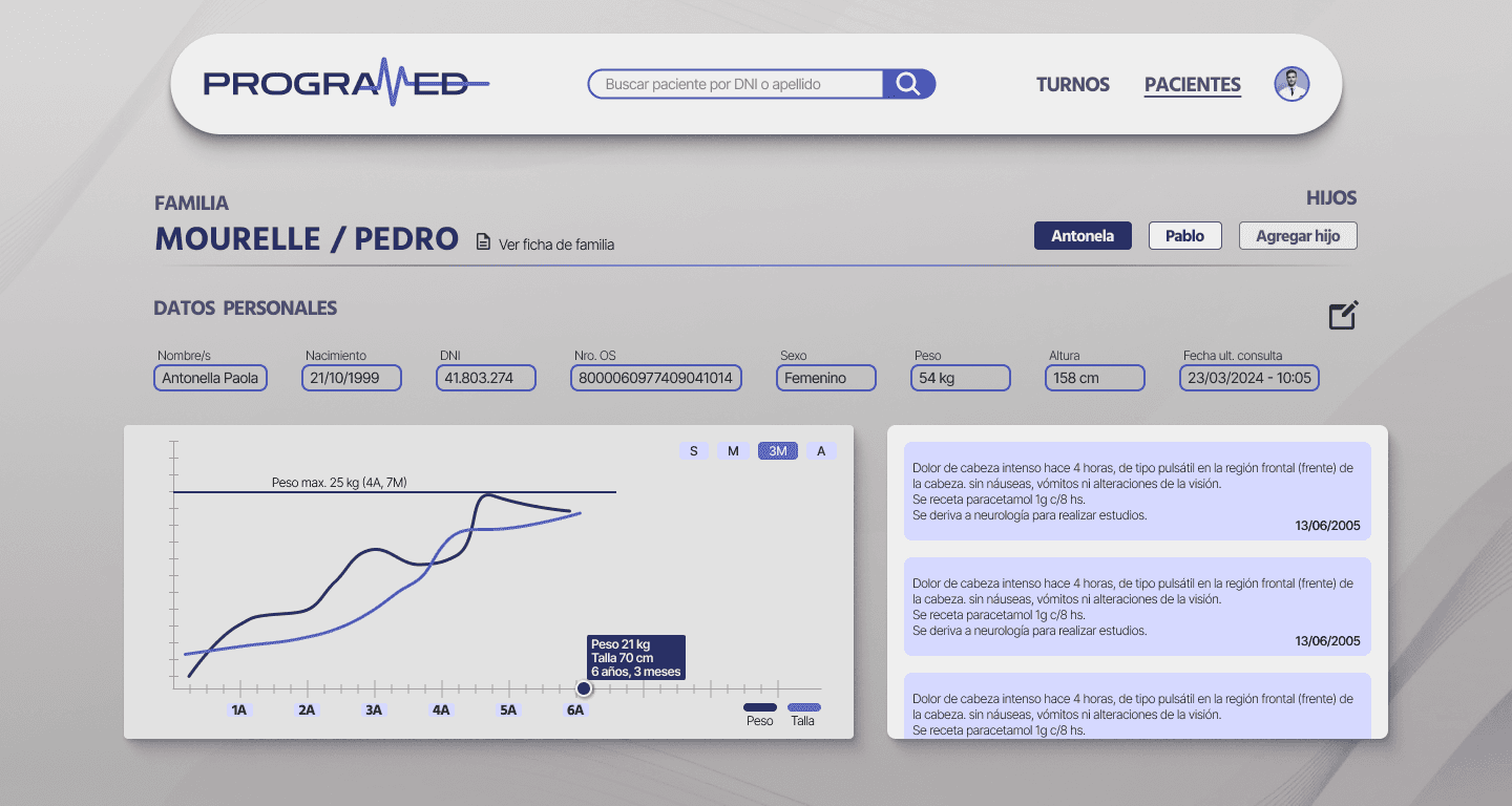
Data was all in text format, making it difficult to
quickly understand patient evolution
After
Complete user-flows, improved navigation, updated UI
Users now have recovery path for most common mistakes
Total control over the schedule (edit, replace, delete) and
control over show and no-show.
Merged screens to reduce navigation
Feedback from the system on common events like
appointment status, data changes, etc.
Dashboard for data overview allowing for quick scans on
patient evolution
Reduced patient waiting times by 25% by improving scheduling efficiency
Decreased user fatigue through improved readability and visual hierarchy
Enabled faster task completion for both medical and administrative staff
Reduced administrative errors by supporting real-world workflows and recovery scenarios
Delivered a scalable design system to support long-term product evolution
Reduced waiting time for appointments.
product of system's errors.
of users reported an improved overall product experience.
Data gathered during presentation at EVA