Ironbrush academy is an online art school that neede help with their website.
Artists struggled to understand course value, pricing, and learning paths, leading to hesitation and low conversion.
I redesigned the information architecture, clarified pricing, and aligned the brand with a more transparent and structured experience.
This resulted in a 50% increase in conversion and a 70% growth in organic community members.
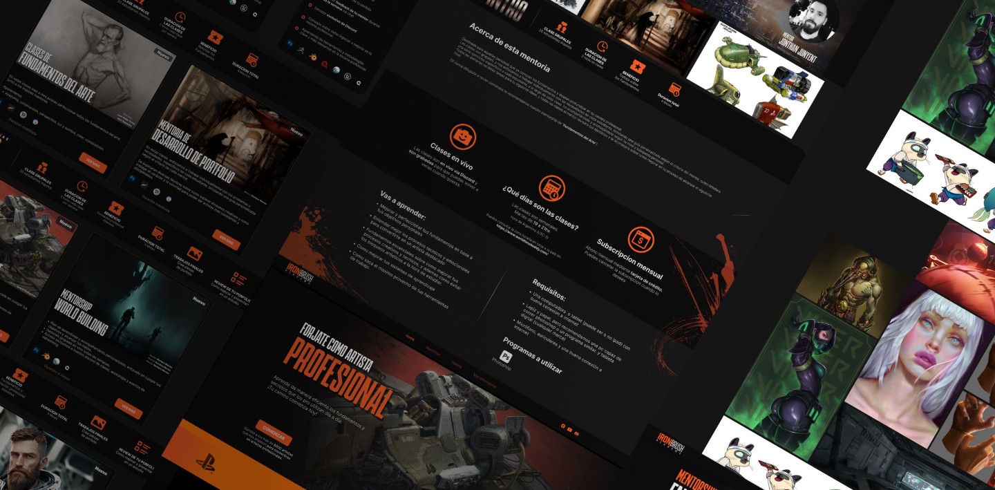
I conducted competitive analysis, user interviews, and usability reviews with aspiring artists, students, and instructors.
Mapped the purchase flow end-to-end to identify friction points and moments of uncertainty.
Iterated through multiple layout and content structures, testing hierarchy, pricing models, and information grouping.
They needed to quickly understand:
what they would learn
how courses were structured
why it was valuable
how much it cost (and in their currency)
Simplified information architecture and course presentation
Clarified pricing structure and introduced multi-currency support
Reinforced value proposition across key decision points
Created a consistent visual hierarchy to guide scanning and understanding
Aligned brand tone to be more direct, transparent, and trustworthy
The platform shifted from a confusing experience to a clear, conversion-oriented product.
+50% increase in conversion
+70% growth in organic community members
Reduced friction in the purchase flow
Stronger alignment between user expectations and product offering
Increase in new students coming
from the website
Comparing identical ad-campaigns
Increase in number of new community members
Mesured in Ironbrush's discord channel